
Conclusion - Taking colour forward in my work
Different species see different colours, some have more cones, or photoreceptor cells in the retina than we do. The cones in our retinas are receptors that together with the process of transduction, have our nerve cells transform the electromagnetic energy that strikes them (the light reflected by the objects on which the gaze falls) into electrical potential, receptor potential.
Essentially there are 3 different types of cones denoted as red, green and blue, and 3 attributes of colour, namely tonality, luminosity, and saturation. These are ideas I wish to explore in my next 6 paintings.

Joseph Albers
German born artist and educator Joseph Albers (1888-1076) explored the optical and psychological effects of colour. Observing his work is instructive in demonstrating how I perceive colour. Each painting is a variation on a simple compositional scheme: 3-4 differently coloured squares nest inside one another, investigating the complex interaction of colours, adjusting their hue, tone and intensity so that the squares connect and separate in different ways.
He emphasised practical exploration over theoretical concerns - something I will take to heart.
Sally Barron
colonialists daughter
2023
Oil on Canvas 900 x 1200 mm
COLOUR AND PROCESS – Emotion, Memory and Hypnogogic states
Hypnagogic can mean specifically allowing oneself to feel in the state just before sleep when one is alert to sensation yet not fully in control of the outcome. A ‘state of painting-mind’ could be the ‘flow’ many people (including musicians and sportspeople) have suggested is a physical and mental state whereby one allows the work to come through and onto the canvas. The French painter Pierre Bonnard (1867-1947) describes this for himself. “Drawing is feeling. Colour is an act of reason.”
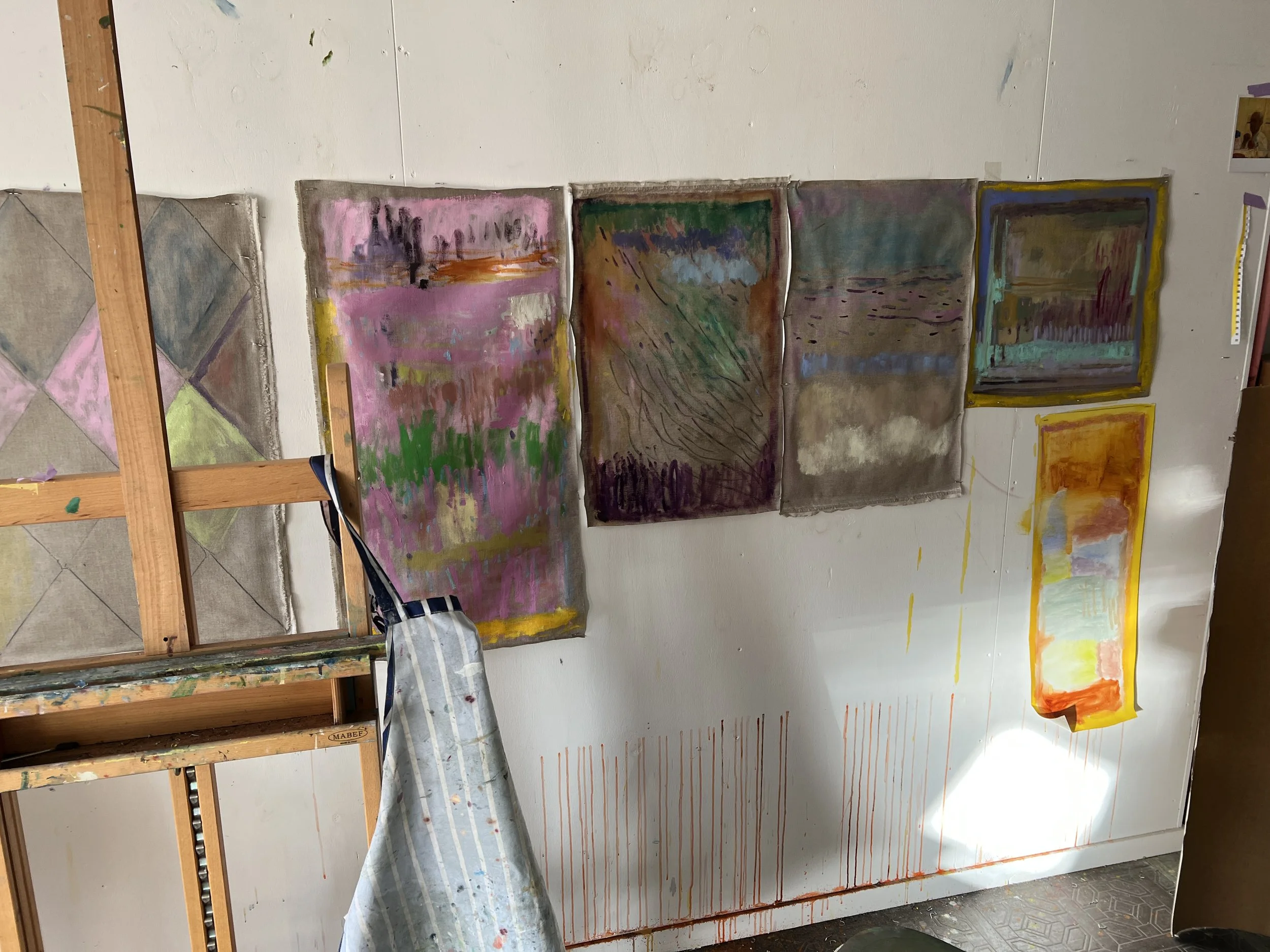
I use repetition of studio habits, mixing paint first, making tea, putting on the same music, total privacy to get into the state of flow. Colours therefore are pre-considered during this process as I must mix large quantities...
I am reminded of this quote ”expressing what exists is an endless task” [bernard cited in Merleau-Ponty 5]
During the first World War the painter Matisse noted “The use of expressive colours is felt to be one of the basic elements of the modern mentality, an historical necessity, beyond choice”
The word colour stems from the Latin word calor meaning “heat”, showing how impossible it is to speak of colour without connecting it to the world of emotion and passion.
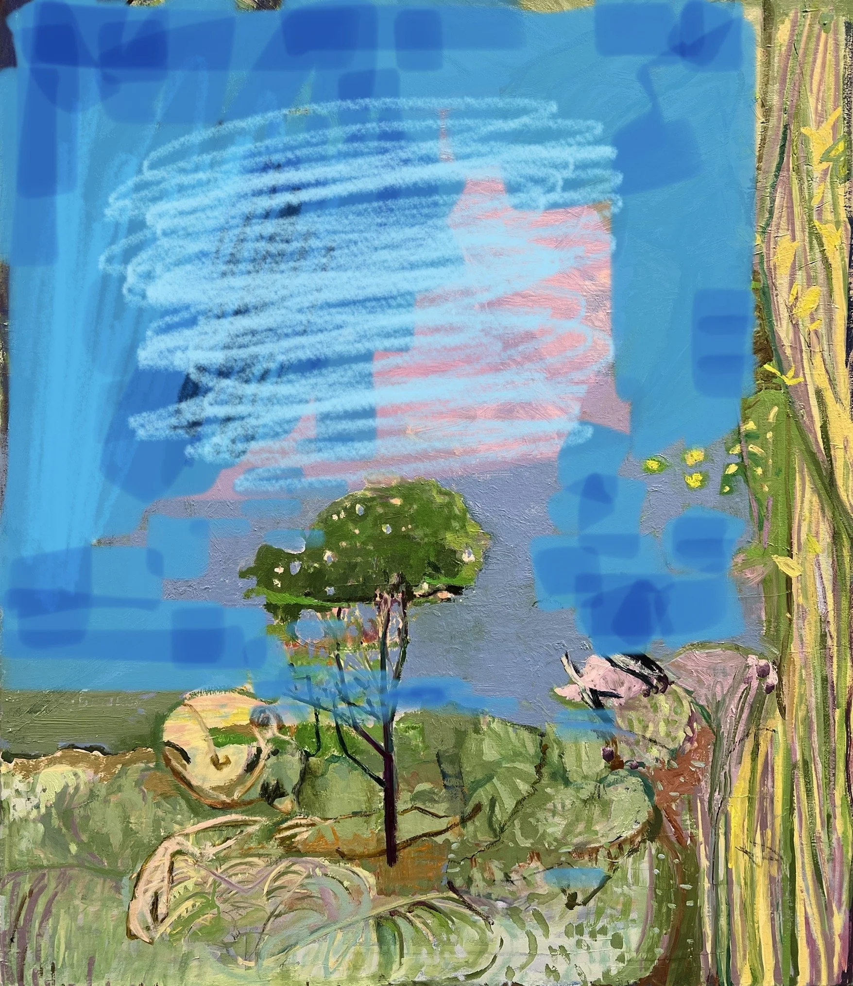
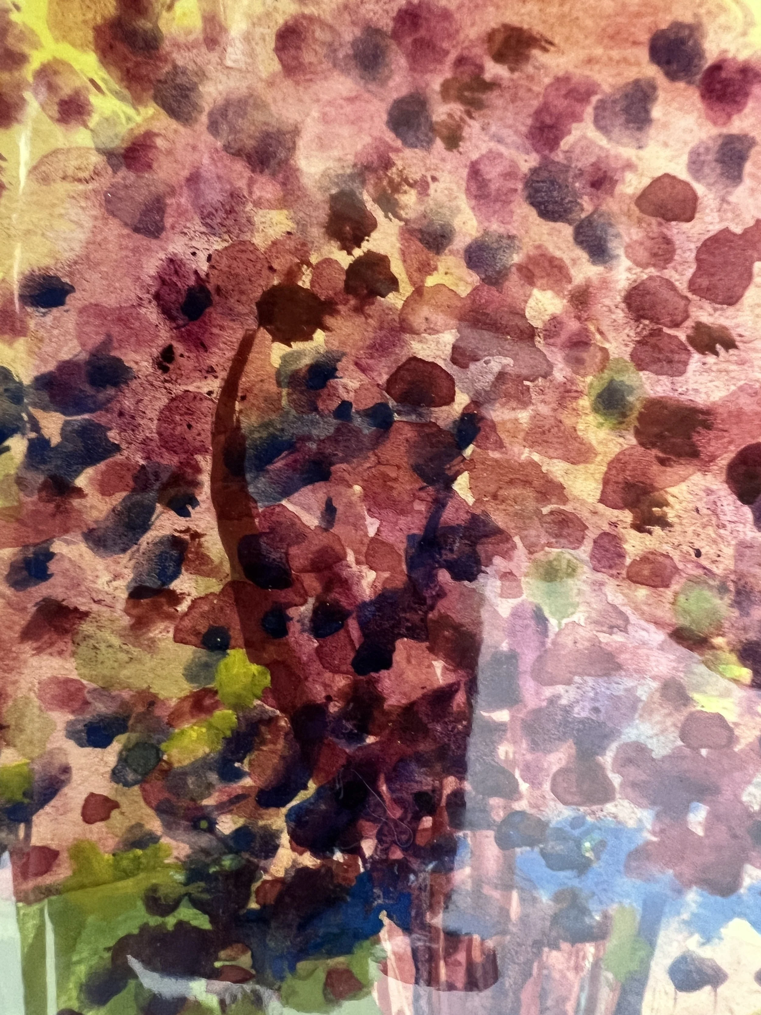
Sally Barron
Water colour and gouache on paper 2023
1869 (mauveine)
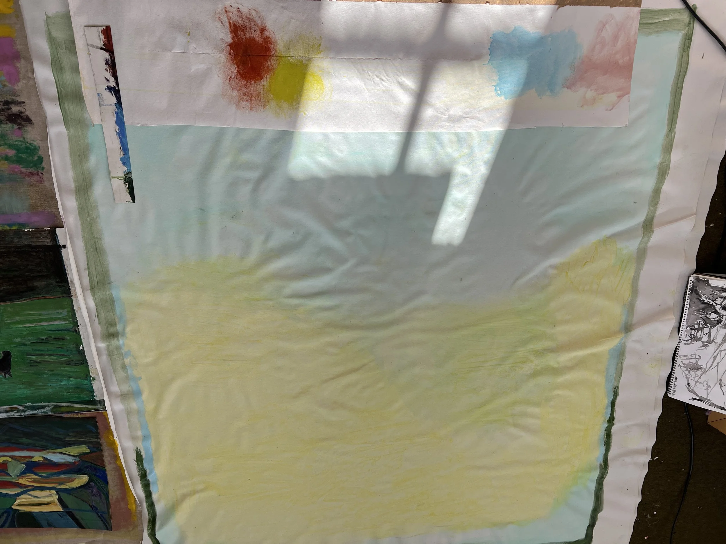
I wish to be aware of the historical use of colours for example when they were invented or widely used, (a case in point being Cezanne’s use of Emerald green which had been recently developed), and limit my palette for each painting, according to the premise of that picture. I can use this as another ‘self-limiting’ tool as I have done with the size of canvas, to try and give myself boundaries to work within and push against.
Sally Barron Watercolour and Gouache on paper 2023
(NB. Cobalt Violet first modern synthetic purple 1859)
Furthermore I want to exploit the affective quality, (the ability of an object or stimulus to cause changes in one's affect - this being the range of feelings people can experience that embodies both emotions and moods), of objects, places, and events.
By this I mean allowing them to enter and be interpreted by my consciousness. I can give myself permission to feel and emote in a way that is personal to me. The Surrealists and Abstract Expressionists used this to great effect with painting, writing and drawing with the aim to suppress rational thought, allowing the subconscious to take control. Stream of consciousness writing (as seen in the text The Automatic Message, 1933 (by artist Andre Breton and the novel Mrs. Dalloway by Virginia Woolf 1925), and automatic drawing, (as seen in the early 20th Century Surrealists such as Hans Arp), were devices used by Surrealists and other artists of the time to create spontaneous and psychologically complex work.

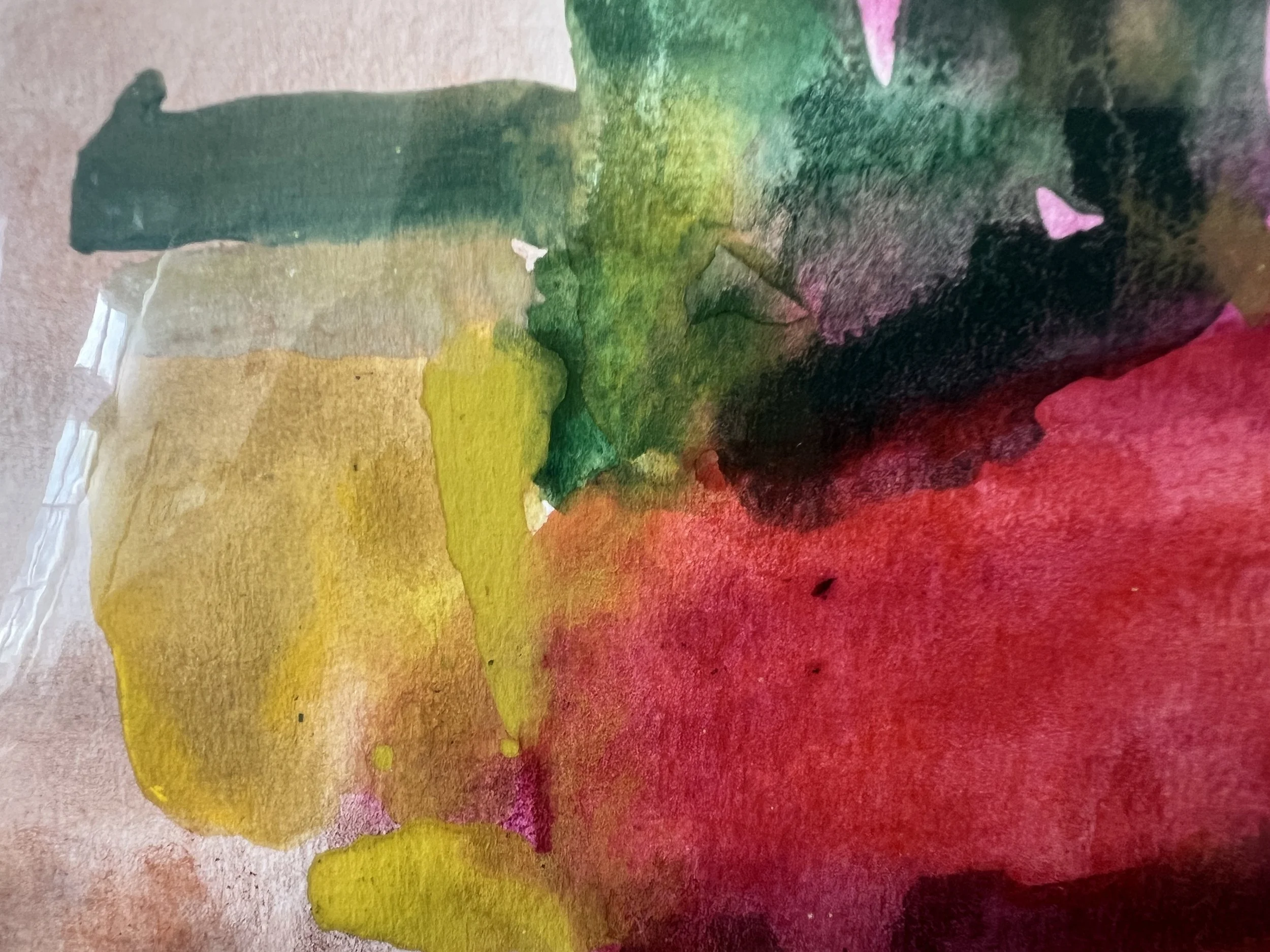
Sally Barron
Gouache and oil on paper 2023
In exploring these ideas, I can further my own practice. The more consciously I use colour to create the emotions I seek to evoke in my paintings the more powerful I feel they will be. I have an interest in synesthesia, the symbology of colours and the representation of higher states of consciousness. I need not be literal about it but must instead be open to the effect such thought can have on my work.
Below is an example of colour use that I greatly appreciated seeing close up. This is one of the works in Peter Dogs show at the Courtauld May 2023 fig 1
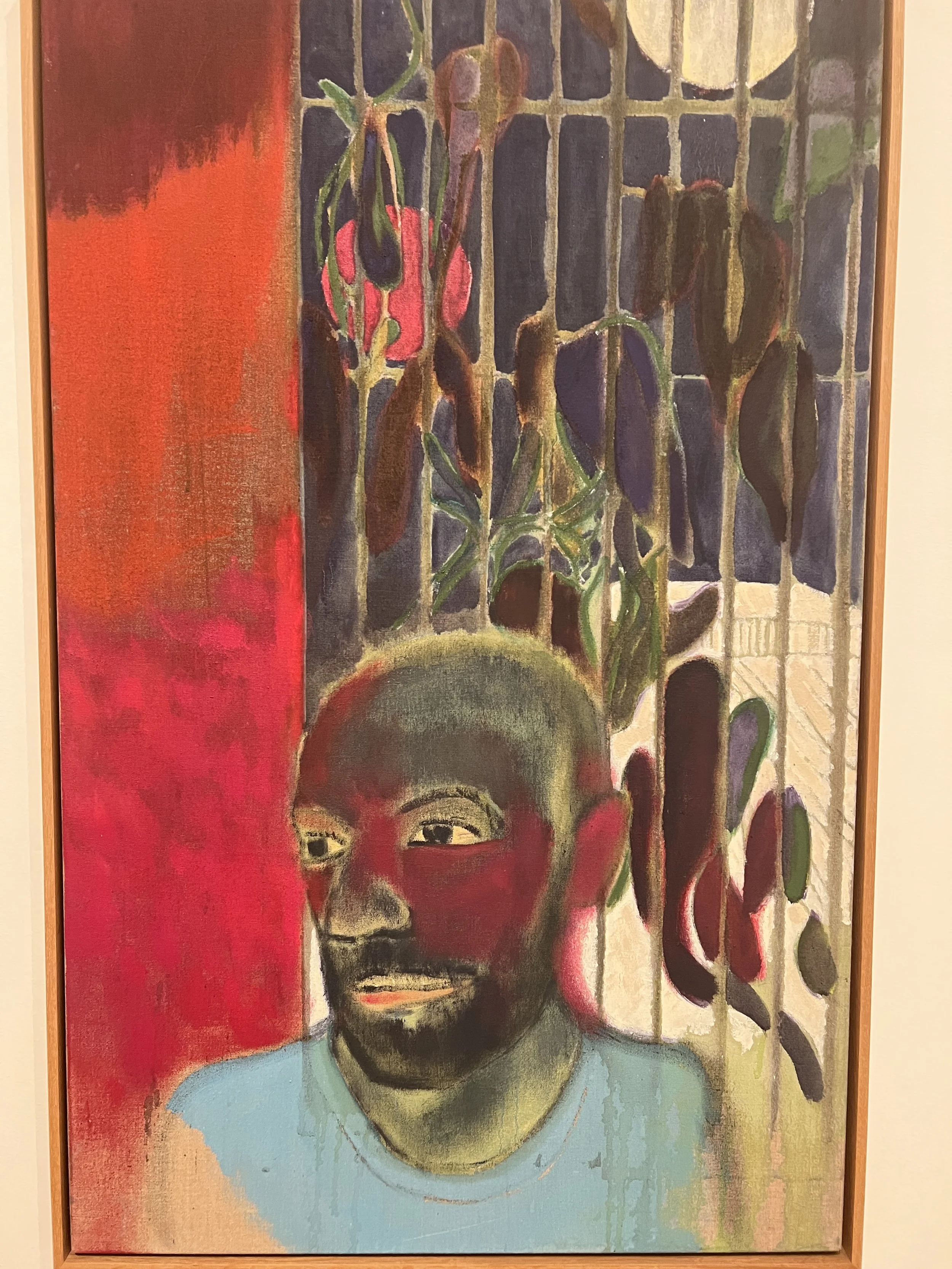
fig 1
Peter Doig
Self Portrait
pigment on linen 2023
The French painter Pierre Bonnard (1867-1947) and in turn Scottish painter Peter Doig (1959-) use sketches and photographs to create paintings that are both memorable and about memory. In the case of Bonnard his personal life and Doig his everywhere and nowhere memories. I am reminded of a scene I may have witnessed in the past or feel familiar with. It is possible to ‘finish’ the story or draw my own conclusions. Furthermore, the marks and processes they use can slow down how the picture is viewed and the time it takes to absorb the work. It could be also that there is an understanding of the time it has taken to create paintings through the marks.
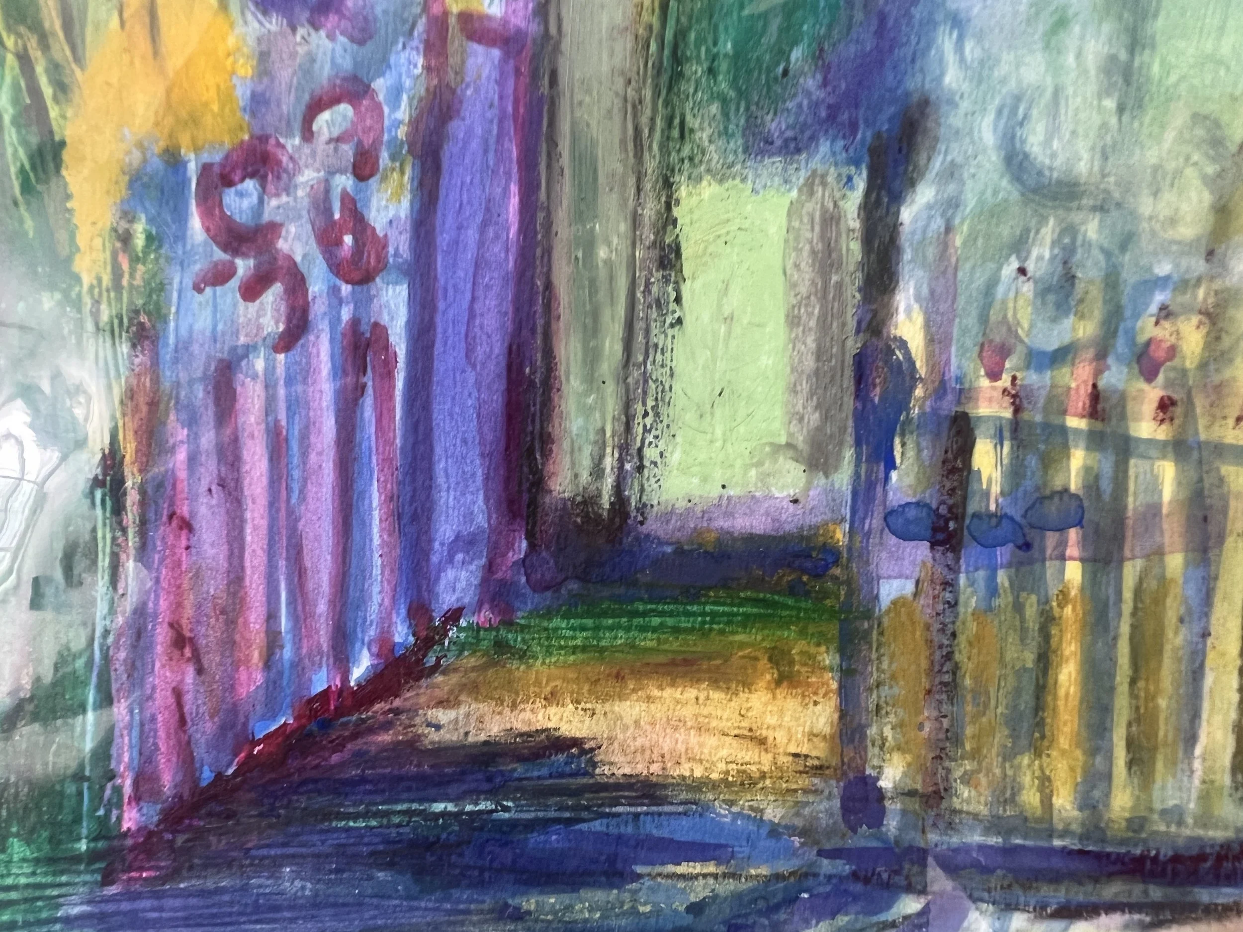
Sally Barron
River side
Water colour oil and gouache on paper 2023
Both can induce a feeling of hypnogogic state through the painting process, layering, clear and unclear marks, colour used in a way that vibrates, suffuses. In Doig this often happens through the transparent glazes of pigment bound in turps or medium, and in Bonnard the placing of complimentary colour or of cool and warm colours used simultaneously to suggest light. His vermillion shadows and cool pink flesh highlighted with pale blues, for example.
Both Bonnard and Doig use the painterly process to emphasise the importance of colour, and texture. The paint itself creates the emotion and sense of memory, or rather the representation of memory. In Doig’s work he combines physical experience with emotive recollection, “they work as meditations on the concept of memory itself.” [Finn Blythe Wednesday Art Idol 14 Aril 2021]
Doig often references the past. Along with his actual subject matter (painting canals for example, a mode of transport belonging to the past) fig 2, often I see the unfinished quality in Doig’s paintings as indication he has not finished with the feeling, or the memory is unclear - the past is still being lived. Doig has said that maybe to move forwards one needs to look back first. [Peter Doig exhibition Catalogue 1923 The Courtauld, 45]
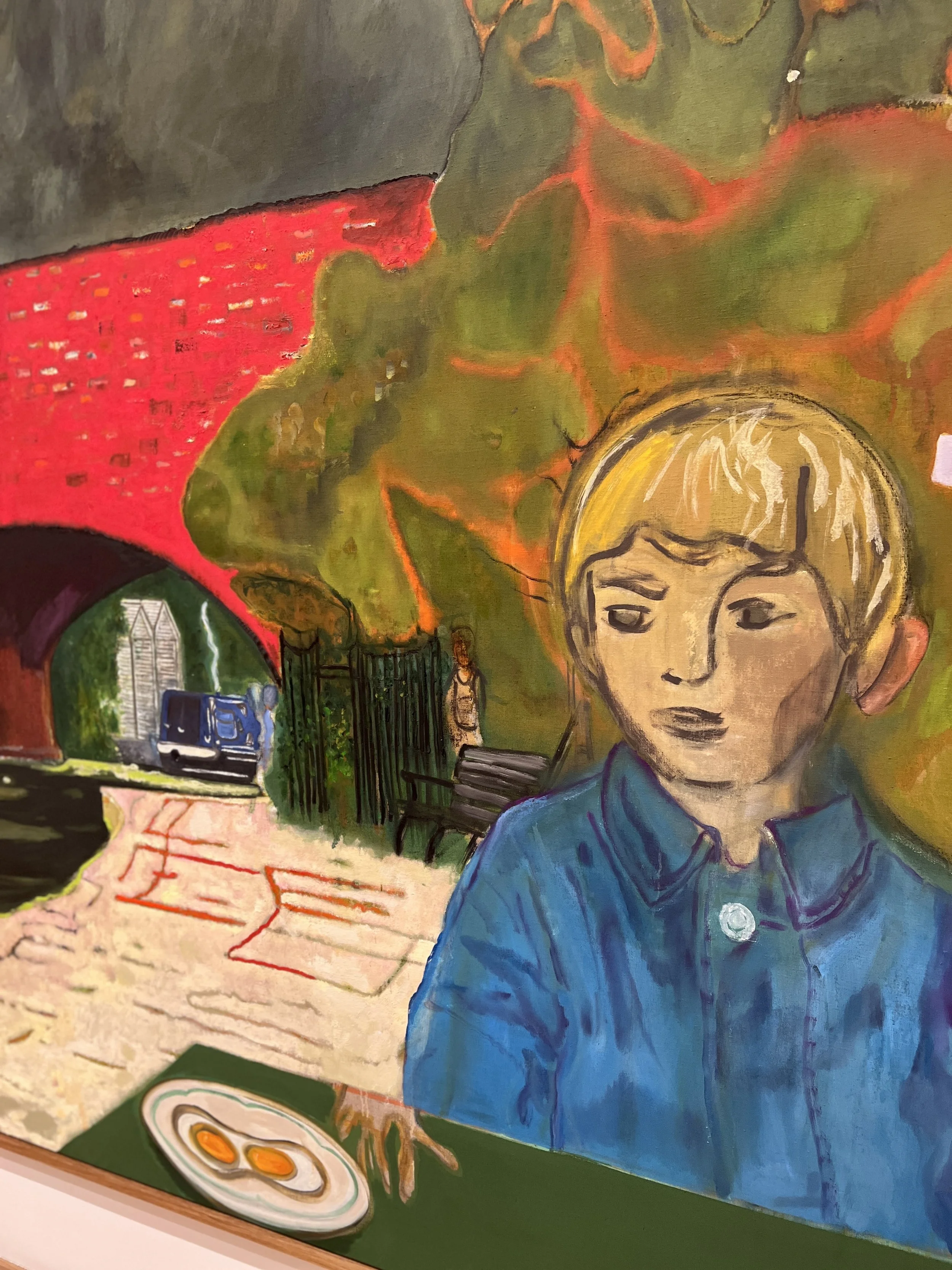
fig 2 detail
Canal
2023
pigment on linen 200x295cm
COLOUR AND BODY – Haptic, Gesture and Action
Carolyn Christov-Barakiv in her opening essay for the 2017 exhibition in Turin GAM Coloris, describes vision as “the most sensual of all the senses, possibly no less about touching than touch itself”.
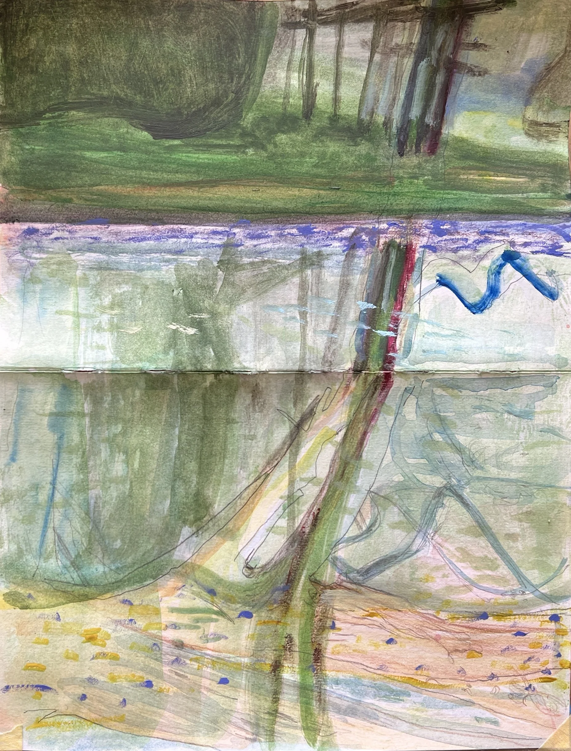
This can be relevant to me as I explore the haptic sensations in my paintings, especially as they relate to natural forms that I can touch such as trees or flowers or the body. These sensations can be shared with the work I make. fig 3

fig 3
bridge over pond
Sally Barron
Gouache and pencil on paper 2023
When thinking about the way our brains process colour and the signs and signals we attach to it perhaps we can understand how this can lead to future ways of seeing, using and creating. A way that enhances rather than depletes the world. I wish to explore “haptic vision”, the area of touch perception. By this I can understand my painting as representing the physical and emotional states I feel.
Landscape motifs often recur in my image making as the most important ones are remembered from my childhood in North Island NZ. Coastline and Seascapes, Mountains, and distant river and hill views from both the Whanganui countryside and the South downs in Sussex UK merge as the two most important landscapes from my life.

seascape
sketchbook
2023
The perception of colour is translated into the electrical code used by the neurons to communicate with one another, that is, action potential.
This brain function could be seen to be mirrored by certain Abstract Expressionist Artists, for example William De Kooning. He talked about the “slipping glimpse " of something felt or seen then translated onto the canvas. I think of these ideas when experimenting in the studio.

Sally Barron
Oil on tracing paper 2023
Often his paintings were inspired by bodily sensations, throwing or dripping paint, scraping back, turning the canvas. I would like to exploit these actions in my work.
Colour and Form
The French painter Vuillard said “We perceive nature through the senses, which give us images of forms of colour” but what if there is no form and only colour?
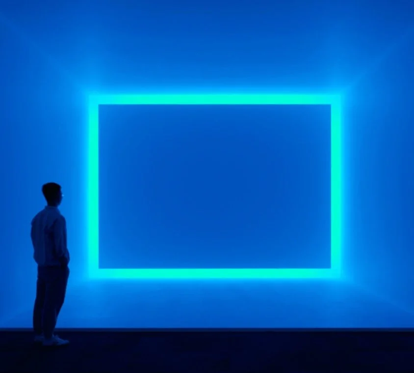
Raemar, Blue, 1969, James Turrell
I enjoyed the work of James Turrell (1943-) Light from the Tate, Raemar, Blue 1969 Fluorescent light. This work is an immersive experience. By working with light as the medium Turrell creates a work with no object, no image, and no focus, you are looking at the act of looking. The power of the blue is enough on its own - to bathe in the light is itself a bodily sensation, as opposed to a rational understanding of an image.
If this idea can be brought into my painting or at least be thought about when looking at a landscape for example I think it will enhance my information gathering. It especially could be something I consider with glazing. The unifying qualities of a single colour glaze is something I have never tried before.
Sally Barron
Acrylic and Oil on unstretched canvas
1650 x 1800 mm
French Painter Paul Cezanne expresses this perfectly for me
“Nature is more depth than surface. Hence the need to introduce into our light vibrations represented by the reds and yellows, enough blue to give the impression of air ” Cezanne
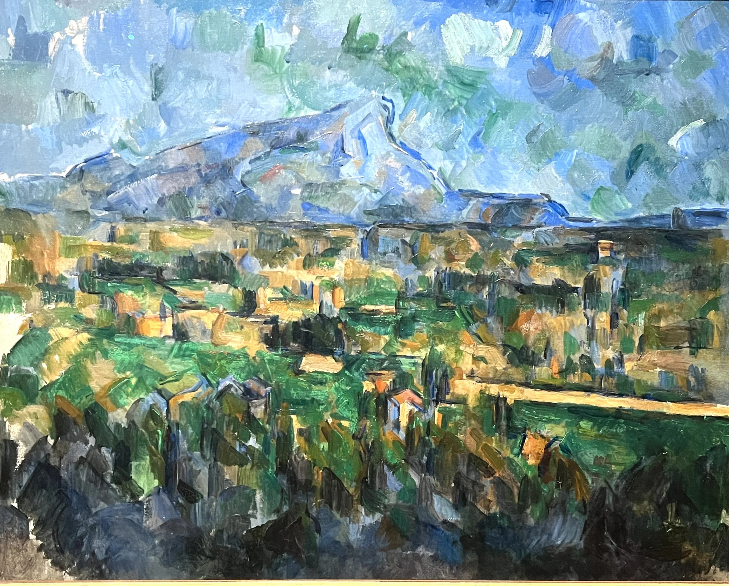
Paul Cezanne (1839-1906)
Mont Sainte-Victoire 1902-6
Cezanne appears to invest each element of this view near his family home on Provence with its own volumetric value. He translates the trees buildings etc into blocks of paint strokes to form a series of faceted surfaces. Many of these facets merge, with the blue lines that describe their edges floating free of their moorings. Additionally, recession is negated through a stacking of horizontal bands.One does not ‘discover’ an object or figure or landscape through the senses but rather right from the first look the depth, smoothness, softness etc. are the contributions that radiate from them.
Cezanne explains that, for him,
“When the colour achieves richness, the form attains its fullness also” There is no model there is only colour” .
When discussing Cezanne (Merleau-Ponty 1964, p.15), conveys the thought that
“If the painter is to express the world, the arrangement of his colours must bear within this indivisible whole, or else his painting will only hint at things and will not give them in the imperious unity, the presence, unsurpassable plenitude which is for us the definition of the real”
Furthermore, for me, for a painting to work in total harmony - the colours and composition become seemingly inevitable as if there was only one outcome for this particular work. A convincing work that bears witness to an individual's lived experience. All things have been considered and explored and a vision created to match it. Not only the colours but the artists themselves demonstrate the ‘indivisible whole’, in their experience of the subject - mind and body cannot be separated.
I wish to create painting where form is bound with colour, whether that is abstract or figurative or in-between should not change the attempt. It seems my interest in the figure/ground has a similar drive, I wish to achieve a oneness with both in the picture.

Collage 2023
Colour, Space, expression, and affective gaze
The search for ‘total space’ is a quest for many painters - Lucien Freud would only paint the rest of a room if the model was also in the space, even if he didn’t paint them, their absence would affect the way the rest of the room felt. Picasso achieves this by the flattening of the picture plane and insistence of the form being one with the colour areas.
Other Artists who use colour in an affective way.
I see in the work of Etal Adnan a joyful and life-affirming depiction of space, she has been quoted as saying “colour is Life. And as long as we live, we are alive.” Etal Adnan 2016
Looking at the work of Adnan I can see the way her mind's eye is creating strong geometric shapes and using colour in response to the landscape, the synesthetic impulse is being allowed to dictate the form. “My right eye merges with colors (sic), the other gets lost in infinity. [...]

In the essay The Sense of Colour , midway between the world body and brain Vittorio Gales and Martina Ardizzi add to this idea by noting the “affective corporeal experience and its historical and critical experience are both an expression of the physical corporeal nature of our gaze”, the “empathic” brain is totally connected to our aesthetic judgment. In other words, we cannot disassociate from our bodily knowledge or experiences, or cultural histories, indeed it will be better to seize the opportunity and encourage these reactions. The French painter Matisse (1869-1954) expresses this succinctly when he said for him “The chief function of colour should be to serve expression. I put down my tones without a preconceived plan” , He feels the colour is right…
Gallese and Ardizzi discuss the ‘anticipation’ of what is to be seen as vital, describing vision as being “a multi-modal process involving not merely the visual areas of the brain but sensory-motor and affective cerebral circuits, we see not just with our eyes but also movement, touch and emotions”. I understand how a painting can be ‘finished’ also in the eye of the viewer, for example I was told in my peer critique that I should trust they understood the figure without it being overly described. A suggestion of a face or a body shape is instantly recognisable for people to see it represents a person, indeed I have found even a vertical line in a landscape can be read as a figure. With regards to colour the eye links similar hues and values throughout the painting.
In referencing back to the en plein air experience as my starting point for work I can allow myself to be stimulated in the first place by the light and atmosphere that interests me - the work can grow from there - the subject matter is this rather than a forced construction of a subject. Colour and its use is embedded within the very exploration of the painting not imposed as an idea after the drawing for example.
As the American painter Richard Diebenkorn (1922 - 1993) said in his diaries “I would like the colours, their shapes and positions to be arrived at in response to and dictated by the condition of the total space at the time they are considered.”

In her essay A Color that is a form of thinking, Christov-Barakgiev insists much of human visual experience involves active reconstruction by the observer. We lose many seconds of continuous vision through our blink reflex and saccadic movements alone, yet we still have a continuous and coherent vision forming a subjective experience.
To collect these experiences and translate them into paintings I must be attuned to recording and recollecting these moments. The Sketchbook is vital.

Colour and Contemporary Examples
I have chosen these works as the paintings below show examples of colour theory being played out in a format of the artists own invention, he has imposed a set of rules upon himself in order to create work.

Alexander Wertheim
The exhibition by Alexander Wertheim, Sunsets at Konig Galerie showcases a series of uniformly large canvases. Additionally, there is an installation of studies on paper. Alexander Wertheim's work is characterised by its focus on seriality. Utilising spray paint on primed canvas, he constructs compositions comprised of vertical and horizontal lines, forming loosely interconnected grids. These lines appear as distinct entities, repeatedly interlocking, "similar to nature, where all sorts of things also rise up vertically, only to be drenched in horizontal color gradients." (Sic. Quote A. Wertheim). The grid mesh exudes a sense of clarity and structure. It visually engages the viewer in an interplay, where opposing tendencies coexist and create a dialogue within the pictorial space.
Wertheim’s work is more rigid than the type of work I am doing right now but there is something to be said for the grouping of work in a series which is helpful to me, as well as the interplay between rationality and emotion. I aim to be systematic in my canvas sizes and colour distinctions.
En plein painting is rather different as I must use or mix the colours on site, after laying out the usual simple palette, (apart from creating a ‘mother’ colour as my main colour). For me it is easier to become immersed in the ‘state of flow’ if you are already surrounded by the light and colour as a guide.
Sally Barron Gouache on paper 2023